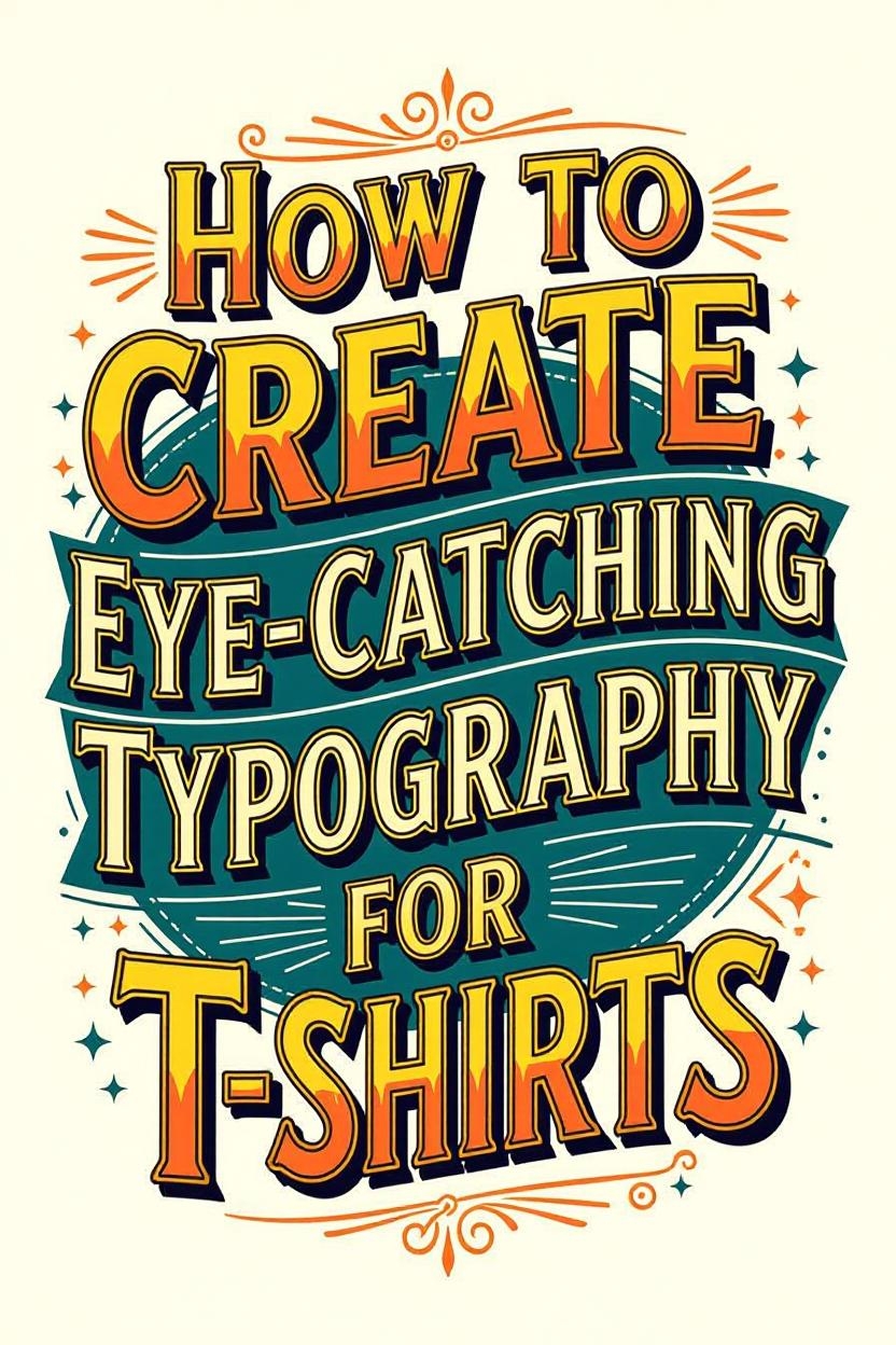
How to Create Eye-Catching Typography for T-Shirts
How to Create Eye-Catching Typography for T-Shirts
Typography is a powerful tool in T-shirt design, turning simple words into bold statements or artistic focal points. Whether you're designing for a brand, event, or personal project, eye-catching typography can make your T-shirt stand out in a crowded market. In this blog post, we’ll explore practical tips and techniques to create typography that grabs attention and elevates your T-shirt designs.
1. Choose the Right Font Style
The font you select sets the tone for your design. With thousands of fonts available, picking the right one is crucial. Here’s how to make the best choice:
Match the Vibe: Align the font with the T-shirt’s theme. For example, a playful, handwritten font works great for casual or youthful designs, while a bold sans-serif font suits modern, minimalist aesthetics.
Consider Readability: Ensure the text is legible, even from a distance. Avoid overly decorative fonts that might obscure the message.
Mix and Match: Combine contrasting fonts, like a bold headline with a subtle script, to create visual interest. Just keep it to two or three fonts to avoid clutter.
Pro Tip: Popular font resources like Google Fonts, DaFont, or Adobe Fonts offer free or affordable options for T-shirt designs. Always check licensing for commercial use.
2. Play with Font Size and Hierarchy
Typography isn’t just about the font—it’s about how you arrange it. Size and hierarchy guide the viewer’s eye and emphasize key elements.
Vary Font Sizes: Use larger fonts for the main message and smaller ones for secondary text. For example, a bold slogan like “Stay Wild” could dominate, with a smaller tagline like “Adventure Awaits” below it.
Create a Focal Point: Make the most important word or phrase the largest element to draw attention instantly.
Use Spacing Wisely: Proper kerning (space between letters) and leading (space between lines) prevent the design from feeling cramped or unbalanced.
3. Incorporate Creative Effects
To make your typography pop, experiment with effects that add personality and flair:
Distressed or Worn Looks: A distressed font can give your T-shirt a vintage, edgy vibe, perfect for streetwear or retro designs.
Outlines and Shadows: Adding outlines or drop shadows can make text stand out against busy backgrounds or colorful fabrics.
Curved or Angled Text: Arching text around a graphic or tilting it for dynamic energy can enhance the overall composition.
Tool Tip: Software like Adobe Illustrator, Canva, or Procreate makes it easy to apply these effects. For beginners, Canva’s drag-and-drop interface is a great starting point.
4. Use Color Strategically
Color can make or break your typography design. Here’s how to use it effectively:
Contrast is Key: Ensure the text contrasts with the T-shirt color for readability. For example, white text on a black shirt or neon colors on a dark background.
Trending Palettes: Stay on trend with colors like vibrant neons, earthy tones, or pastels, depending on your target audience.
Limit Your Palette: Stick to two or three colors to keep the design cohesive and avoid overwhelming the viewer.
Pro Tip: Test your design on different T-shirt colors to ensure versatility, especially if you’re selling online.
5. Align with the T-Shirt’s Purpose
Every T-shirt has a story or purpose, and your typography should reflect that:
Brand Identity: If designing for a brand, use fonts and styles that align with its values. A luxury brand might lean toward elegant serifs, while a fitness brand might opt for bold, athletic fonts.
Target Audience: Consider who will wear the T-shirt. Gen Z might love quirky, meme-inspired text, while professionals might prefer clean, sophisticated typography.
Cultural Relevance: Incorporate trending phrases, slang, or quotes that resonate with your audience. For example, a T-shirt with “Good Vibes Only” in a bold script could appeal to a wide crowd.
6. Test and Refine Your Design
Before sending your design to print, take time to refine and test it:
Mock It Up: Use mockup tools like Placeit or Smartmockups to see how your typography looks on a T-shirt. This helps you spot issues with scale or placement.
Get Feedback: Share your design with friends, colleagues, or your target audience to gauge their reactions.
Check Print Compatibility: Ensure your design works with your chosen printing method (e.g., screen printing, DTG, or vinyl). Some intricate fonts may not translate well with certain techniques.
7. Stay Inspired by Trends
Keep your designs fresh by staying updated on typography trends:
Follow Designers on Social Media: Platforms like Instagram and Pinterest are goldmines for spotting trending fonts and styles.
Explore Streetwear and Pop Culture: Look at what’s popular in music, movies, or social movements for inspiration.
Experiment with Bold Choices: Don’t be afraid to try unconventional fonts or layouts to stand out.
Conclusion
Creating eye-catching typography for T-shirts is all about blending creativity with strategy. By choosing the right fonts, playing with size and effects, and aligning with your audience’s vibe, you can design T-shirts that turn heads and spark conversations. Start experimenting with these tips, and don’t be afraid to let your unique style shine through. Ready to create your next viral T-shirt design? Grab your tools and get started!


